Drawn Lines: What the Tube Map Isn't Telling You About London's Inequality
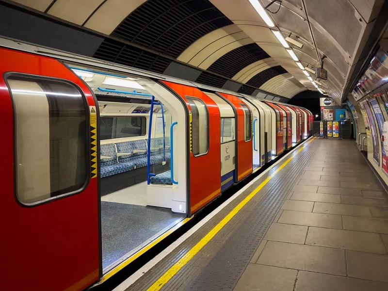
Photo: Photograph by Mike Peel (www.mikepeel.net)., CC BY-SA 4.0, via Wikimedia Commons
Everyone loves the Tube map. It's been called one of the great design achievements of the twentieth century — clean, elegant, deceptively simple. Stick it on a tote bag, a tea towel, a tourist's fridge magnet. But that cheerful diagram, with its colour-coded lines radiating outwards like a child's drawing of the sun, has a habit of flattening something rather more complicated underneath.
Because London's transport network wasn't built according to any grand democratic vision. It was built — largely by private companies, in fits and starts across more than 150 years — to serve the people who already had money. And the echoes of those decisions are still shaping the city today in ways that are easy to miss if you're just trying to get from Paddington to London Bridge.
The Geography of Access
Spend any time living in different parts of London and the disparity becomes visceral. Step off a Tube train in Canary Wharf — all gleaming concourses and retail units — and compare it with the experience of a resident in Peckham, Lewisham, or Walthamstow who relies on a bus network that, however much TfL tries, still means longer journeys, more transfers, and less reliability.
The north-south divide in particular is striking. South London — home to enormous, diverse, vibrant communities — is chronically underserved by the Underground. The reasons are partly geological (the clay that makes tunnelling relatively straightforward under north London gives way to waterlogged ground south of the river) and partly historical (the Victorian rail companies had already carved up much of south London with overground routes, making Underground investment seem redundant to the private financiers of the day). The result is that huge swathes of Lewisham, Woolwich, and Southwark spent decades as what planners euphemistically call 'transport deserts'.
The Elizabeth Line's arrival has started to shift things in east London, and the Overground has gradually stitched together some previously isolated communities. But progress is slow, and in the meantime, the postcode lottery of transport access continues to do its quiet work.
What a Tube Station Does to a Neighbourhood
Want to understand gentrification? Follow the infrastructure. When transport links improve, property values follow — almost without exception. Brixton, Dalston, Peckham: each has seen waves of change partly catalysed by improved connectivity. The opening of the East London Line extension in 2010 is widely credited with accelerating the transformation of Shoreditch and Hoxton from affordable creative hubs into some of the most expensive postcodes in the capital.
It's a cycle that planners and residents have grown wearily familiar with. Better transport brings in new businesses and wealthier residents. Rents rise. The communities that gave an area its character — often working-class, often Black and Asian — find themselves priced out. The neighbourhood becomes desirable precisely because of the culture those communities created, but they rarely get to stay and enjoy it.
Northumberland Park in Haringey, Barking and Dagenham, parts of Croydon: these are places where residents are still waiting for the investment that might bring those same opportunities. The question is whether, when it arrives, it will actually benefit them.
The Bus as a Class Marker
There's a reason buses appear in conversations about inequality in a way that the Tube rarely does. The Tube has a certain romance — a mythology built up over a century of posters, films, and fond commuter memories. The bus, by contrast, is often treated as a fallback option, something you take when you have no choice.
But in reality, London's buses carry more passengers than the Underground. They are, by a significant margin, the transport of the working city. And the people who rely on them most heavily — lower-income workers, older residents, those without cars — are disproportionately concentrated in the outer zones and south London boroughs where tube coverage is thinnest.
Cuts to bus routes in recent years have hit these communities hardest. When a route disappears, it might mean a slightly longer walk for one person. For someone working night shifts, or caring for elderly relatives, or juggling two jobs, it can mean something considerably more disruptive.
Reading the Map Differently
None of this is to say the Tube isn't a remarkable thing — it is. On any given weekday morning, it moves millions of people across one of the world's most complex cities with a kind of mundane efficiency that only becomes visible when it breaks down. But it's worth occasionally holding the map at arm's length and asking whose city it was designed around.
The stations themselves tell part of the story. The grand, Leslie Green-designed Edwardian stations of Mayfair and Kensington — with their ox-blood faience tiles and ornate detailing — were built to impress. They were gateways to wealthy neighbourhoods, designed with a confidence that said: this is somewhere worth arriving. Compare them with the more functional, less celebrated infrastructure serving outer east or south London, and a different set of priorities becomes apparent.
For visitors, this gives London's transport network a second layer of interest beyond the purely practical. Next time you're navigating the city, notice where the Overground runs above ground through residential streets, close enough to see into people's kitchens. Notice which areas have multiple station options and which have none. Notice how the map's neat geometry papers over the very untidy reality of who lives where, and why.
A City Still Drawing Its Lines
London is not static. Crossrail 2, if it ever gets built, promises to transform north-south connectivity. The Bakerloo line extension to Lewisham has been discussed for decades and may yet happen. The gradual expansion of the Overground network — rebranded with individual line names in 2024 — is slowly filling in some of the gaps.
But infrastructure takes time, and in the meantime, the city continues to be shaped by the decisions made in Victorian boardrooms and twentieth-century planning offices. The map tells you how to get around. It doesn't tell you nearly enough about how the city got this way — or who paid the price for the lines that were never drawn.